js+css实现扇形导航效果
(编辑:jimmy 日期: 2024/9/20 浏览:2)
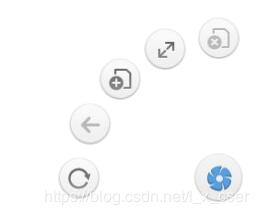
本文实例为大家分享了js+css实现扇形导航效果的具体代码,供大家参考,具体内容如下\
<!DOCTYPE html>
<html>
 <head>
 <meta charset="utf-8">
 <title>扇形导航</title>
 <style type="text/css">
  *{
  margin: 0;
  padding: 0;
  }
  html,body{
  height: 100%;
  overflow: hidden;
  }
  #wrap{
  height: 50px;
  width: 50px;
  /* background-color: pink; */
  position: fixed;
  right: 15px;
  bottom: 15px;
  /* overflow: hidden; */
  }
  #wrap>.home{
  height: 49px;
  width: 49px;
  /* margin: auto; */
  background: url(img/home.png) ;
  background-position: center;
  border-radius: 50%;
  transition: 1s;
  position: absolute;
  z-index: 1;
  }
  #wrap>.nav{
  height: 100%;
  position: relative;
  }
  #wrap>.nav>img{
  position: absolute ;
  right: 0px;
  bottom: 0px;
  margin: 4px;
  border-radius: 50% ;
  }
  .home:hover{
  transform: rotate(360);
  }
 </style>
 </head>
 <body>
 <div id="wrap">
  <div class="home"></div>
  <div class="nav">
  <img src="/UploadFiles/2021-04-02/clos.png">


以上就是本文的全部内容,希望对大家的学习有所帮助,也希望大家多多支持。
